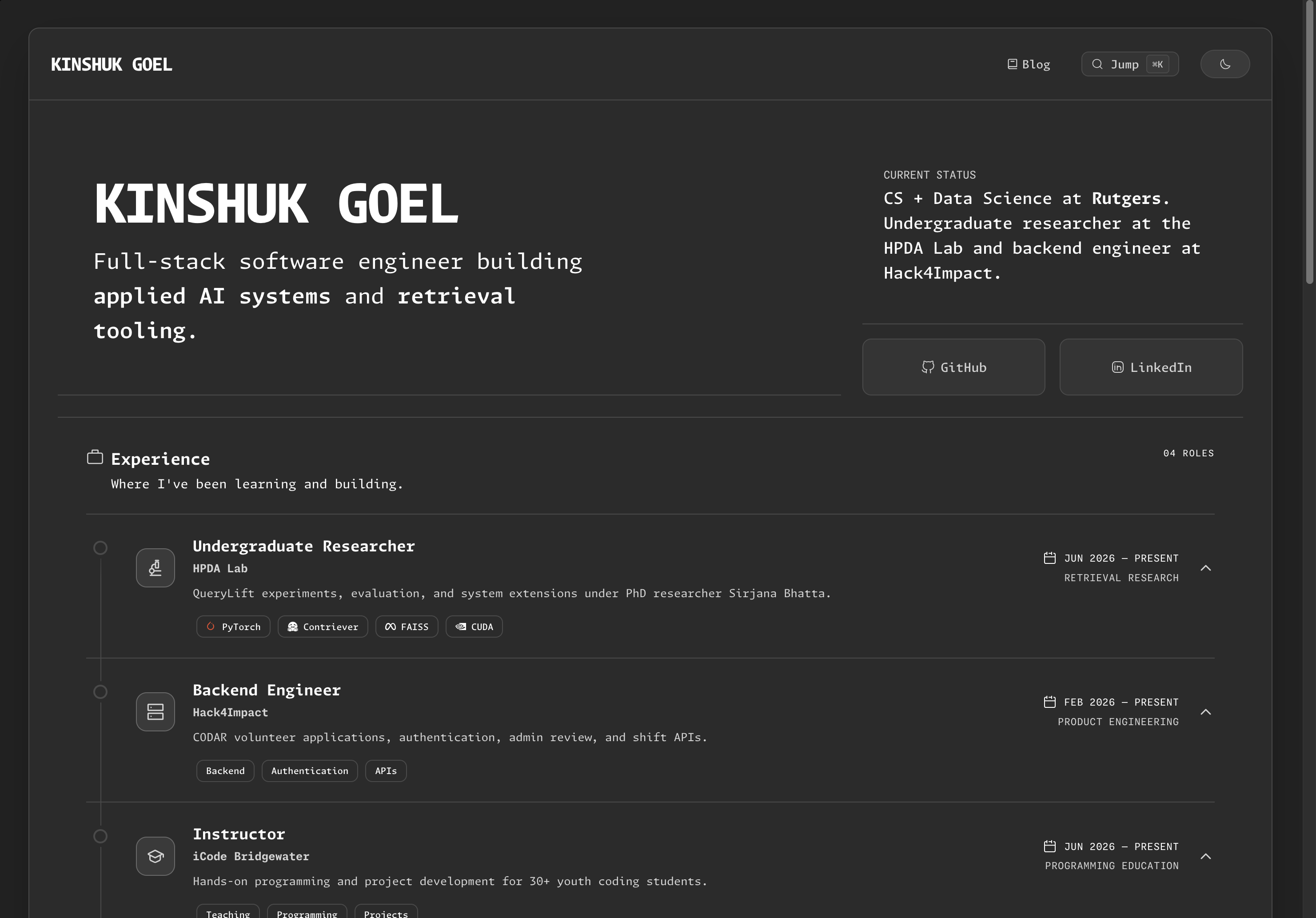
The site looked more polished after each revision, but it still did not make my work easier to understand. A project card could show that I built something, but it could not explain what problem I was solving, which tradeoffs mattered, or what I learned when the first version was not enough.
The problem with a finished-looking portfolio
A project card can show that a project exists. It can name the stack and link to a repository or live demo.
That still leaves out the useful questions:
- What problems was I trying to solve?
- What tradeoff shaped the implementation?
- What did the first version get wrong or leave unresolved?
- How should someone understand the project beyond its feature list?
My site cannot answer those questions with design aesthetics. The site needs writing that answers those questions.
Why the site became a writing-first home
The projects are still the center of the site. The writing gives them enough context to be useful.
The KareBud article explains why the prompt pipeline separates Critic, Designer, and Implementer roles instead of treating every response as one prompt
The AI Resume Analyzer article explains why it collects evidence before generating feedback, instead of presenting generic advice as personalized.
The ZenTreeTabs report walks through the difference between a semantic embedding and a product decision.
Those details are hard to fit into a one-line project description. They make more sense as they build notes that someone can read when they want to go deeper.
I also want room for experiments that are not quite projects yet. That might be an offline model test, an engineering question, a car, or a design decision that I am still working through. A portfolio does not need to pretend every thought is a launch announcement.
What stayed simple
The implementation is meant to stay intentionally ordinary. Next.js as the framework, Markdown rendering, reusable UI components, and a local source for public posts.
project -> context -> decision -> result -> next question
A reader should be able to understand the project summary in a minute. If they stay longer, the article should show the reasoning underneath.
What I stopped adding
I stopped treating every visual idea as a feature.
It is very easy to add visual effects that can make a website stand out more to users, but that doesn’t mean it helps signify the information on there. So the rule is simple: if an effect does explain a state, improve navigation, or make the content easier to read, then it probably doesn’t belong here.
Which explains the color scheme for this website.
Salt & Pepper
I’ve probably wasted a ton of time trying to pick out the right color scheme for my website.
That is why the visual system is restrained. It exists to support reading and navigation, not to make the site look more sophisticated.
I personally have spent too much time trying different colors and visual styles before settling on a palette with its own restraints. This final choice mattered less because it was aesthetically perfect and more because it kept the focus on the work itself.
What I Expect From This Version of My Site
This site should help someone understand my work quickly, then reward them for staying longer.
I want the site to make my work legible quickly. The writing is there for anyone who wants to go more technical and see the reasoning, tradeoffs, mistakes, and next questions underneath.
The first version of a project can be rough. I do not want the writing to hide that. I would rather explain a constraint clearly than describe a small feature as a breakthrough. I would rather publish a useful experiment than wait until every result sounds impressive.
Writing also forces me to understand and explain my own decisions instead of letting AI smooth over gaps in my thinking. That is a better reason to renovate a portfolio than add another effect.